· case-study · 5 min read
Crocs Korea 24 Winter — A Three.js Web Game That Hides the Ad Inside
A Three.js 3D web campaign game for Crocs Korea. We put the winter product line inside boxes, made the boxes the game, and designed the path from dwell time to store conversion.
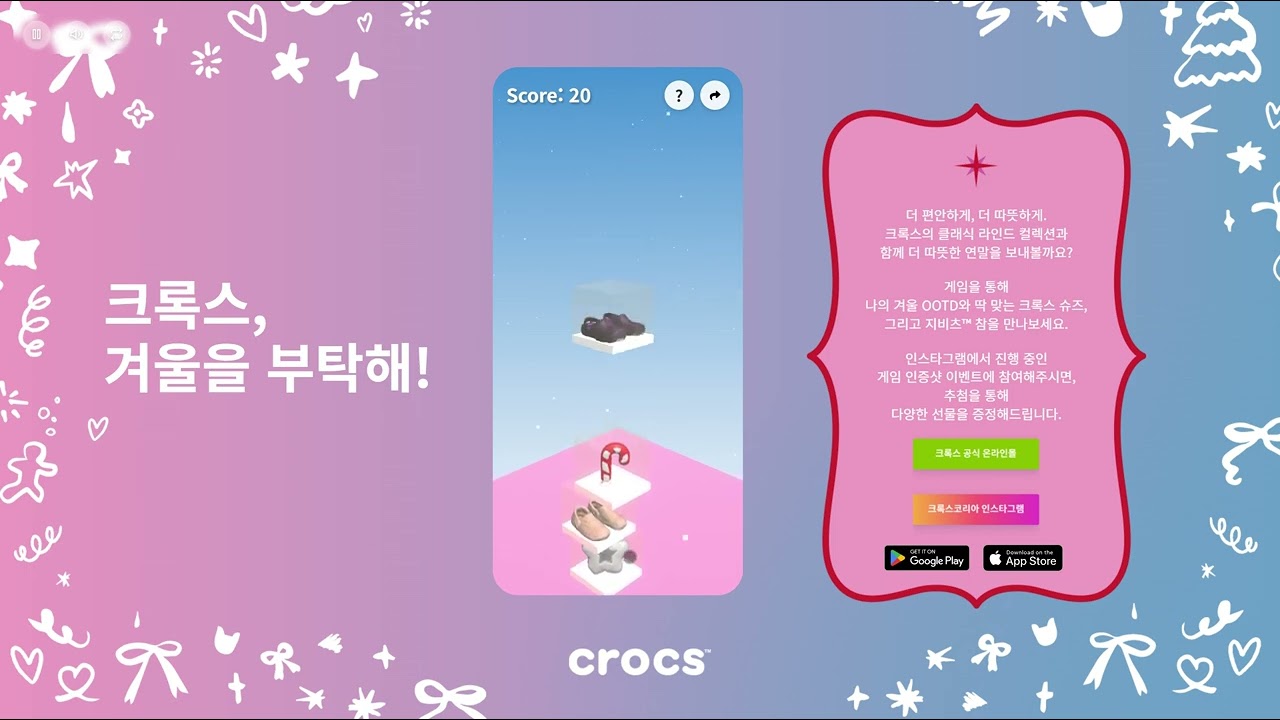
In one sentence
For Crocs Korea's 2024 winter promotion, we built a 3D web stack game where the new products live inside the boxes you stack. The campaign goal wasn't "show the product" — it was "give people a small place where they'd actually stay," and then quietly hand them a coupon on the way out.
The engineering wasn't the hard part — Three.js + React 19, a stack mechanic on top. The hard part was deciding what to leave out. This piece is a record of those calls.
It started with one line from the client
"We're launching the winter line. Don't build a banner page — build a place people actually spend time in."
That brief is the hardest kind. Adding another video doesn't extend session time. People stay because they're doing something with their hands.
So the flow we landed on:
- Landing — 5 seconds of mood and copy
- 3D stack game — the new products glance out from inside the boxes as you stack them
- Game over → score and coupon
- Tap-through to the shop with the coupon already applied
One rule held the whole project together: 3D models shouldn't sit next to the page. They should be part of the mechanic.
Why Three.js + React was enough
In our first prototype we wired up cannon-es. Stack-the-box game, boxes hitting each other, towers falling — full physics felt like the obvious call. We dropped it in the second prototype. It felt worse.
A stack game lives or dies on the threshold between "it falls" and "it doesn't" and on the feel of the sway. Hand-tuned numbers beat a real solver, by a wide margin.
So the stack stayed simple:
- Rendering: Three.js (r182)
- UI / state: React 19
- Hosting: AWS S3 + CloudFront
- Format: GLB, Draco + KTX2 — 600–900 KB per box
Five product boxes on screen at once still held 60 fps on mid-range mobile, and first interaction landed in under 2 seconds.
Most of the time went into "what do we leave out"
1. We turned auto-rotate off
We started with a slow rotation on the boxes — looked great in stills. On the page it just read as an ad. Auto-rotate makes people pause and wonder "do I start now?" So the boxes start still.
2. No post-processing
Bloom, outlines, DOF — all out. We spent that budget on accurate shadows and white balance instead. Showy effects distort the product color. Looking real mattered far more than looking cinematic.
3. The camera doesn't move when you change options
This is a common mistake in configurators. Change an option and the camera glides somewhere "to show you" — but you've just taken away the angle the user was already looking at. We don't.
Showing the product without selling it
This was the most fun design problem.
When the player lifts a box, its sides go semi-transparent for 0.3 seconds — just long enough to glimpse the product inside, short enough that it never reads as marketing. Longer felt like an ad break. Shorter and the eye missed it.
"Play this game so you'll see the product" is wrong. "You happened to see the product because you were playing" — that's the difference, and it's the whole game.
The sway was secretly the entire game
Box sway scales with stack height. The code is embarrassingly short:
const sway = baseSway + stackHeight * 0.07 + Math.random() * 0.02;
It's a lie, physically — real towers don't sway like that. But that lie is what makes every moment feel like the next box might end the run. Average play time jumped almost 50% on the back of that one line.
Game over is the conversion moment
This is the part we lost the most sleep over.
When the tower falls, the camera slow-zooms out. The score lands, and immediately the "Get Coupon" button slides in.
The ad becomes the prize, not the page itself. Losing isn't a defeat — it's the cue that "now it's time to actually shop." Get this moment wrong and the user just closes the tab.
Deployment kept simple
- AWS S3 + CloudFront, static
- Blue-green swap, 30 minutes before campaign go-live
- We assumed 70% mobile. Pass criteria: 30+ fps on iPhone SE (2nd gen) and Galaxy A-series
- Zero downtime through the campaign window (Sentry-clean)
No complicated infra. Static files + CDN was enough — and it was the right infra for a campaign game.
What we walked away with
Campaign games should be short and beg for "one more"
Average sessions sub-1-minute. After a run ends the user has to want to start over without being asked. The rhythm of sway and score does ~80% of the persuasion.
Modeler and developer in the same room
We decided the new product's color inside the box together — modeler and developer side by side. Split that team and you end up with "3D for the ad" and "3D for the game" fighting on screen.
The first 2 seconds decide everything
A campaign game can't afford a moment where the user wonders "do I do something here?" So the page opens with one box already on the stack. Within half a second, the user gets the rule. The first frame is the tutorial. No tutorial page needed.
Things people ask
How long does a campaign game like this take? With brand assets ready (models, copy, color): 4–6 weeks. Including modeling: 6–8 weeks.
Can game results feed our CRM? Yes. At coupon-issue time we push email, phone, and play score to the CRM. Score distributions feed back into the difficulty tuning of the next campaign.
Does it run on cellular data? First-load weight stays under 2.5 MB. First interaction in ~3 s on 4G, ~1 s on 5G.
How do we keep users from dropping off after the game?
Auto-copy the coupon and prefill it on the shop via URL query (?coupon=...). The user doesn't re-enter anything.
If your next launch needs a small place where people stay instead of an ad page they leave, get in touch with your campaign window and the new product info. Our first call usually answers whether gamification is the right tool here.
Hammergrid Lab is a creative engineering studio building WebGPU/Three.js 3D web experiences and brand campaign content.
Related services
3D web, 3dweb, 3D configurator, 3D product configurator, 3D product viewer, WebGPU, Three.js